Responsive Design: Why It Matters More Than Ever
Responsive Design: Why It Matters More Than Ever
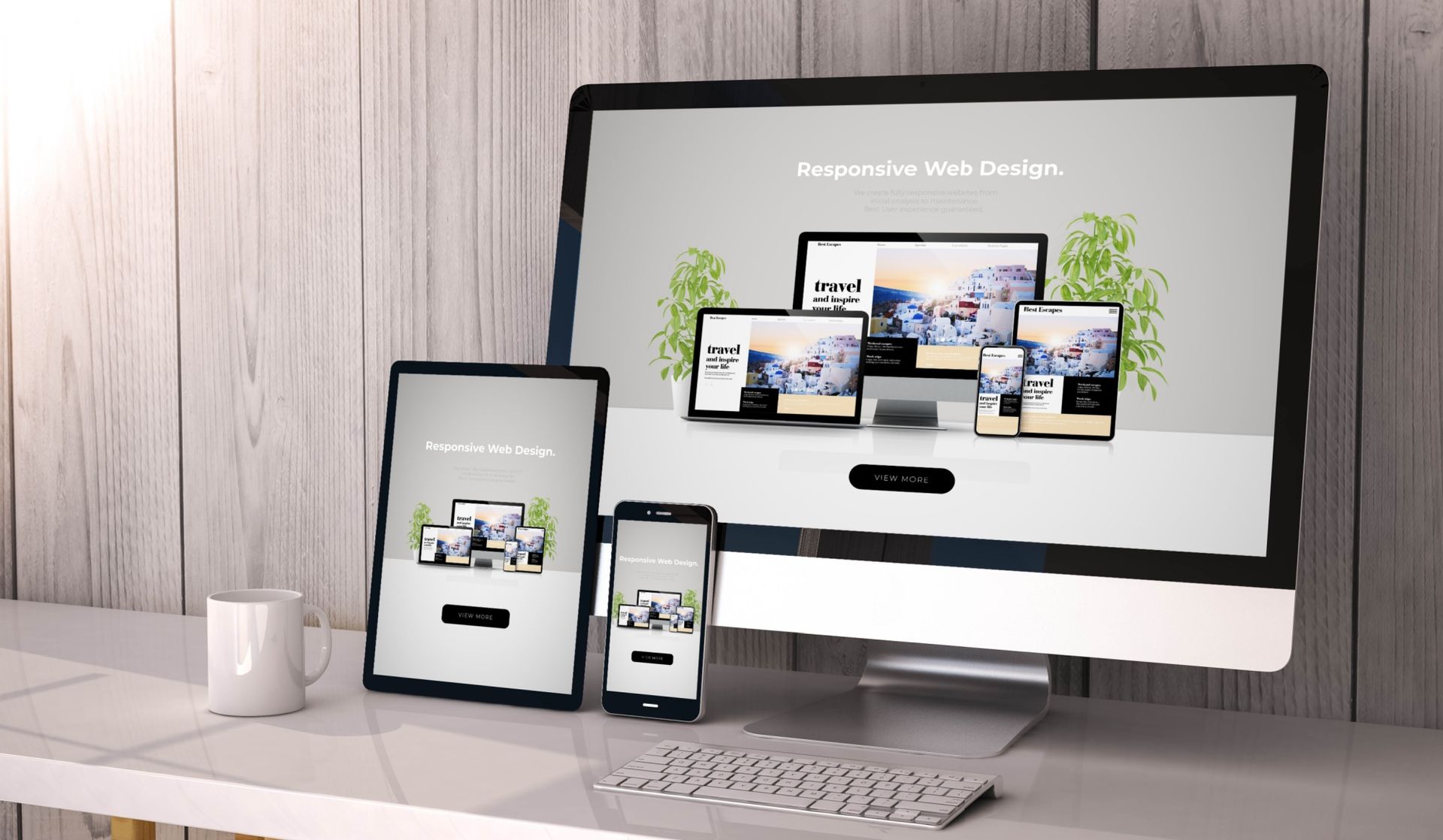
What Is Responsive Design?
Responsive design is an approach to web design that allows a website to adapt seamlessly to different screen sizes and devices. Whether a user is on a desktop, tablet, or smartphone, the layout, images, and text automatically adjust for optimal viewing. This ensures content is easy to read and navigate without excessive zooming or scrolling. Responsive design focuses on flexibility, using fluid grids and scalable elements. As device usage continues to grow, this adaptability is no longer optional.
The Rise of Mobile-First Browsing
More users now browse the web on mobile devices than on traditional desktops. Responsive design supports a mobile-first mindset by prioritizing usability on smaller screens first. This approach ensures key content, buttons, and navigation are easy to access with touch interactions. If a site performs poorly on mobile, users are more likely to leave quickly. Designing responsively helps capture and retain today’s on-the-go audience.
User Experience and Engagement
A responsive website creates a smoother and more enjoyable user experience across all devices. When layouts adjust properly, users can easily find information without frustration. Consistent design and functionality build trust and keep visitors engaged longer. Poor responsiveness often leads to broken layouts or unreadable text, which can hurt credibility. A strong responsive design keeps users focused on content, not design flaws.
SEO Benefits of Responsive Design
Search engines prioritize websites that provide a strong mobile experience. Responsive design helps improve search rankings by offering one consistent site rather than separate desktop and mobile versions. Faster load times and reduced bounce rates also contribute positively to SEO performance. When users stay on a site longer, search engines recognize it as valuable content. A responsive layout supports both visibility and performance online.
Future-Proofing Your Website
New devices and screen sizes are constantly emerging, from smartwatches to large ultra-wide monitors. Responsive design allows websites to adapt without needing constant redesigns. This flexibility saves time and money in the long run. Businesses that invest in responsive design are better prepared for future technology changes. It ensures a website remains relevant, functional, and competitive over time.
Want a mobile-friendly website that improves user experience and search visibility in the Greater Toronto Area? Professional responsive website design and SEO services can help your business stay competitive online.
Contact Us